Card
Flexible container component for grouping related content and actions
Import
import {Card} from "@heroui/react";Usage
PAYMENT
You can now withdraw on crypto.
Add your wallet in settings to withdraw
"use client";

import {Card, Link} from "@heroui/react";
import {Icon} from "@iconify/react";

export function Default() {
  return (
    <Card className="w-[400px]">
      <Icon
        aria-label="Dollar sign icon"
        className="text-primary size-6"
        icon="gravity-ui:circle-dollar"
        role="img"
      />
      <Card.Header>
        <Card.Title>PAYMENT</Card.Title>
        <Card.Description>You can now withdraw on crypto.</Card.Description>
      </Card.Header>
      <Card.Content id="payment-content">
        <p>Add your wallet in settings to withdraw</p>
      </Card.Content>
      <Card.Footer>
        <Link
          aria-label="Go to settings (opens in new tab)"
          href="https://heroui.com"
          rel="noopener noreferrer"
          target="_blank"
        >
          Go to settings
          <Link.Icon aria-hidden="true" />
        </Link>
      </Card.Footer>
    </Card>
  );
}
Anatomy
Import all parts and piece them together.
import {Card} from "@heroui/react";

export default () => (
  <Card>
    <Card.Header>
      <Card.Title />
      <Card.Description />
    </Card.Header>
    <Card.Content />
    <Card.Footer />
  </Card>
);
Variants
Variant Flat
Transparent background with no border
Content with no variant styling
Variant Outlined
This card uses outlined variant (default)
Content with subtle elevation
Variant Elevated
This card uses elevated variant
Content with medium elevation
Variant Filled
This card uses filled variant
Content with higher elevation
"use client";

import {Card} from "@heroui/react";

export function Variants() {
  return (
    <div className="flex flex-col gap-4">
      <Card className="w-[320px]" variant="flat">
        <Card.Header>
          <Card.Title>Variant Flat</Card.Title>
          <Card.Description>Transparent background with no border</Card.Description>
        </Card.Header>
        <Card.Content>
          <p>Content with no variant styling</p>
        </Card.Content>
      </Card>

      <Card className="w-[320px]" variant="outlined">
        <Card.Header>
          <Card.Title>Variant Outlined</Card.Title>
          <Card.Description>This card uses outlined variant (default)</Card.Description>
        </Card.Header>
        <Card.Content>
          <p>Content with subtle elevation</p>
        </Card.Content>
      </Card>

      <Card className="w-[320px]" variant="elevated">
        <Card.Header>
          <Card.Title>Variant Elevated</Card.Title>
          <Card.Description>This card uses elevated variant</Card.Description>
        </Card.Header>
        <Card.Content>
          <p>Content with medium elevation</p>
        </Card.Content>
      </Card>

      <Card className="w-[320px]" variant="filled">
        <Card.Header>
          <Card.Title>Variant Filled</Card.Title>
          <Card.Description>This card uses filled variant</Card.Description>
        </Card.Header>
        <Card.Content>
          <p>Content with higher elevation</p>
        </Card.Content>
      </Card>
    </div>
  );
}
Horizontal Layout
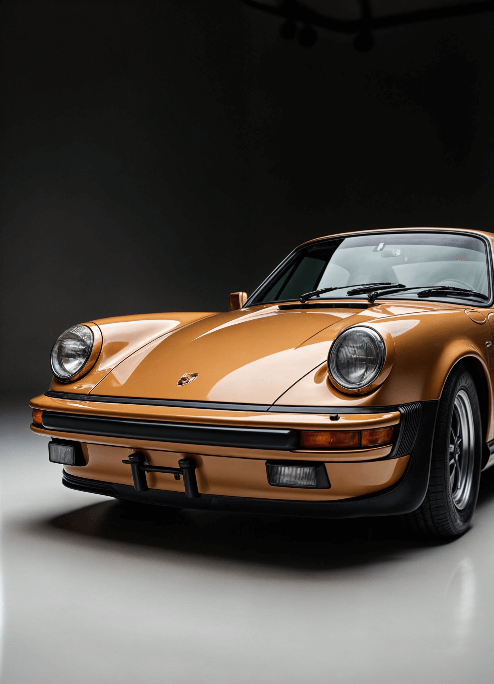
Get the new Porsche 911 golden edition
Experience unmatched luxury and performance with the Porsche 911 Golden Edition—where sleek design meets cutting-edge tech and pure driving thrill.
"use client";

import {Button, Card} from "@heroui/react";

export function Horizontal() {
  return (
    <Card className="w-full items-stretch md:flex-row">
      <img
        alt="Porsche 911 Golden Edition"
        className="rounded-panel pointer-events-none aspect-square w-full select-none object-cover md:max-w-[136px]"
        loading="lazy"
        src="https://heroui-assets.nyc3.cdn.digitaloceanspaces.com/components/card/porsche-911.png"
      />
      <div className="flex flex-1 flex-col gap-3">
        <Card.Header className="gap-1">
          <Card.Title>Get the new Porsche 911 golden edition</Card.Title>
          <Card.Description>
            Experience unmatched luxury and performance with the Porsche 911 Golden Edition—where
            sleek design meets cutting-edge tech and pure driving thrill.
          </Card.Description>
        </Card.Header>
        <Card.Footer className="mt-auto flex w-full flex-row items-center justify-between">
          <div className="flex flex-col">
            <span
              aria-label="Price: 36,799 US dollars"
              className="text-foreground text-sm font-medium"
            >
              $36,799
            </span>
            <span aria-label="Available stock: 11 units" className="text-muted text-xs">
              11 available
            </span>
          </div>
          <Button>Buy Now</Button>
        </Card.Footer>
      </div>
    </Card>
  );
}
With Avatar
Indie Hackers
148 members
 IHBy Martha
AI Builders
362 members
 BBy John
"use client";
import {Avatar, Card} from "@heroui/react";
export function WithAvatar() {
return (
<div className="flex flex-col gap-4 md:flex-row">
<Card className="w-[200px] gap-2">
<img
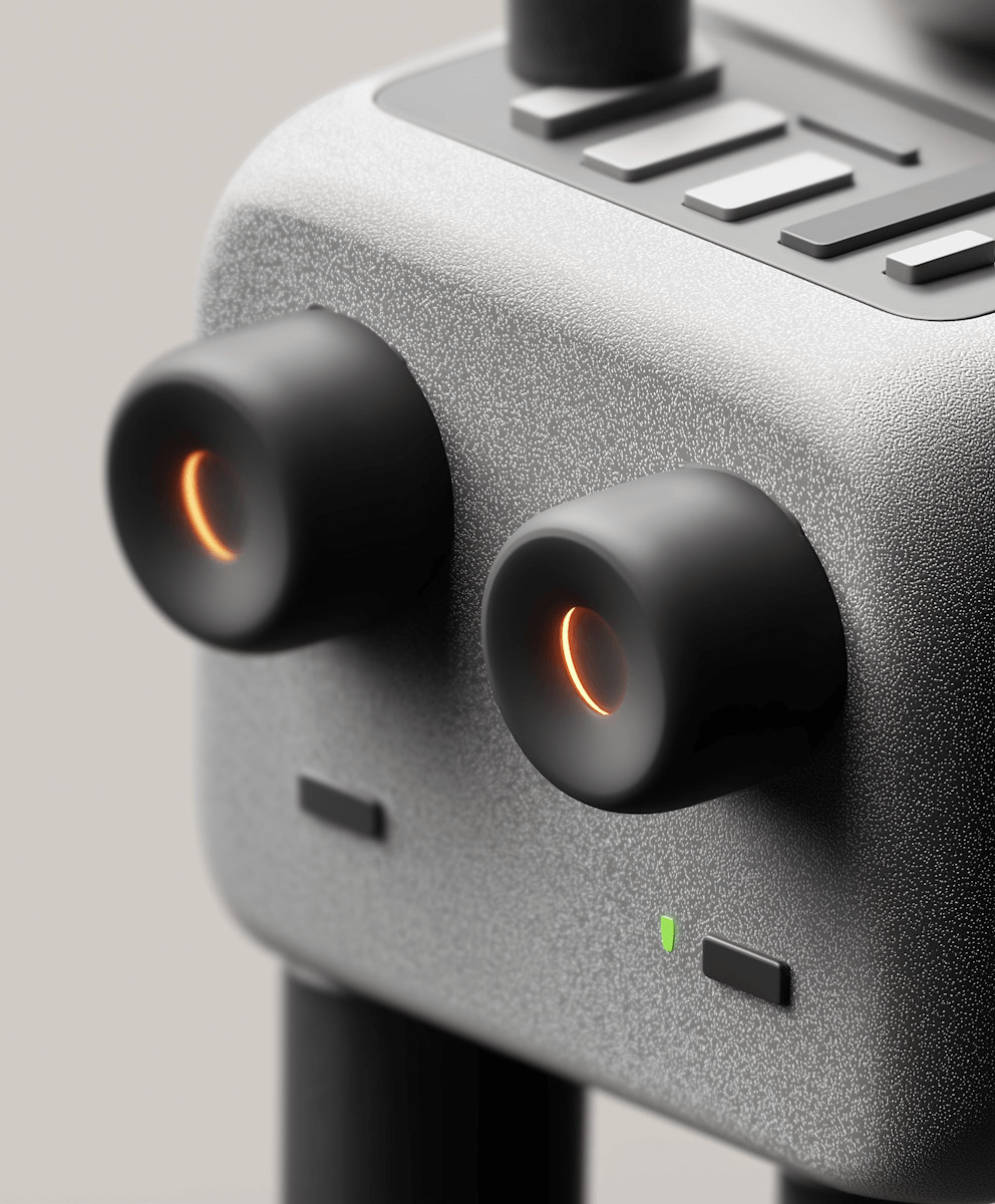
alt="Indie Hackers community"
className="rounded-panel pointer-events-none aspect-square w-14 select-none object-cover"
loading="lazy"
src="https://heroui-assets.nyc3.cdn.digitaloceanspaces.com/components/card/device.png"
/>
<Card.Header>
<Card.Title>Indie Hackers</Card.Title>
<Card.Description>148 members</Card.Description>
</Card.Header>
<Card.Footer className="flex gap-2">
<Avatar aria-label="Martha's profile picture" className="size-5" role="img">
<Avatar.Image
alt="Martha's avatar"
src="https://img.heroui.chat/image/avatar?w=160&h=160"
/>
<Avatar.Fallback className="text-xs">IH</Avatar.Fallback>
</Avatar>
<span className="text-xs">By Martha</span>
</Card.Footer>
</Card>
<Card className="w-[200px] gap-2">
<img
alt="AI Builders community"
className="rounded-panel pointer-events-none aspect-square w-14 select-none object-cover"
loading="lazy"
src="https://heroui-assets.nyc3.cdn.digitaloceanspaces.com/components/card/ai-bot.png"
/>
<Card.Header>
<Card.Title>AI Builders</Card.Title>
<Card.Description>362 members</Card.Description>
</Card.Header>
<Card.Footer className="flex gap-2">
<Avatar aria-label="John's profile picture" className="size-5" role="img">
<Avatar.Image
alt="John's avatar - blue themed"
src="https://heroui-assets.nyc3.cdn.digitaloceanspaces.com/avatars/blue.jpg"
/>
<Avatar.Fallback className="text-xs">B</Avatar.Fallback>
</Avatar>
<span className="text-xs">By John</span>
</Card.Footer>
</Card>
</div>
);
}With Image

"use client";

import {Card} from "@heroui/react";

export function WithImage() {
  return (
    <div className="flex flex-col gap-4 md:flex-row">
      <Card className="w-[220px] gap-2 p-1">
        <img
          alt="Luxury cars collection"
          className="block aspect-square w-full shrink-0 select-none rounded-[calc(theme(--radius-panel)-theme(spacing.1))] object-cover align-middle"
          loading="lazy"
          src="https://heroui-assets.nyc3.cdn.digitaloceanspaces.com/components/card/porsche-911.png"
        />
        <Card.Footer className="flex items-center justify-between px-2 text-sm">
          <span>Cars</span>
          <span aria-label="18 pictures in collection" className="text-muted">
            18 pictures
          </span>
        </Card.Footer>
      </Card>

      <Card className="w-[220px] gap-2 p-1">
        <img
          alt="Modern office workspace"
          className="block aspect-square w-full shrink-0 select-none rounded-[calc(theme(--radius-panel)-theme(spacing.1))] object-cover align-middle"
          loading="lazy"
          src="https://heroui-assets.nyc3.cdn.digitaloceanspaces.com/components/card/workspace.jpeg"
        />
        <Card.Footer className="flex items-center justify-between px-2 text-sm">
          <span>Workspaces</span>
          <span aria-label="56 pictures in collection" className="text-muted">
            56 pictures
          </span>
        </Card.Footer>
      </Card>
    </div>
  );
}
With Background Image

PET HEALTH
Your pet deserve the best

"use client";

import {Button, Card} from "@heroui/react";
import {Icon} from "@iconify/react";

export function WithBackgroundImage() {
  return (
    <div className="flex flex-col items-center justify-center gap-6 md:flex-row">
      <Card className="aspect-[280/337] w-full max-w-[280px]">
        {/* Background image */}
        <img
          alt="Happy pet"
          aria-hidden="true"
          className="pointer-events-none absolute inset-0 h-full w-full select-none object-cover"
          src="https://heroui-assets.nyc3.cdn.digitaloceanspaces.com/components/card/dog.png"
        />

        {/* Top gradient blur overlay */}
        <div
          aria-hidden="true"
          className="pointer-events-none absolute left-0 right-0 top-0 h-[76px]"
        >
          <div
            className="absolute inset-0 h-[-200%] backdrop-blur-sm"
            style={{
              WebkitMaskImage: "linear-gradient(to bottom, black 80%, transparent)",
              maskImage: "linear-gradient(to bottom, black 80%, transparent)",
              maskRepeat: "no-repeat",
              maskSize: "100% 100%",
            }}
          />
        </div>

        {/* Header */}
        <Card.Header className="z-10 text-white">
          <Card.Title className="text-xs font-medium tracking-wide text-white/80">
            PET HEALTH
          </Card.Title>
          <Card.Description className="text-lg font-medium leading-6 text-white">
            Your pet deserve the best
          </Card.Description>
        </Card.Header>

        {/* Bottom gradient blur overlay */}
        <div
          aria-hidden="true"
          className="pointer-events-none absolute bottom-0 left-0 right-0 h-[64px]"
        >
          <div
            className="absolute inset-0 h-[200%] backdrop-blur-sm"
            style={{
              WebkitMaskImage: "linear-gradient(to top, black 80%, transparent)",
              maskImage: "linear-gradient(to top, black 80%, transparent)",
              maskRepeat: "no-repeat",
              maskSize: "100% 100%",
            }}
          />
        </div>

        {/* Footer */}
        <Card.Footer className="z-10 mt-auto flex items-center justify-between">
          <div>
            <div className="text-sm font-medium text-white">Available soon</div>
            <div className="text-xs text-white/60">Get notified</div>
          </div>
          <Button size="sm" variant="tertiary">
            Notify me
          </Button>
        </Card.Footer>
      </Card>

      <Card className="aspect-[65/56] w-full md:w-[390px]">
        {/* Background image */}
        <img
          alt="Beautiful aerial view of Buenos Aires cityscape"
          aria-hidden="true"
          className="pointer-events-none absolute inset-0 h-full w-full select-none object-cover"
          src="https://heroui-assets.nyc3.cdn.digitaloceanspaces.com/components/card/mountain.png"
        />

        {/* Bottom gradient blur overlay */}
        <div
          aria-hidden="true"
          className="pointer-events-none absolute bottom-0 left-0 right-0 h-[64px]"
        >
          <div
            className="absolute inset-0 h-[200%] backdrop-blur-sm"
            style={{
              WebkitMaskImage: "linear-gradient(to top, black 80%, transparent)",
              maskImage: "linear-gradient(to top, black 80%, transparent)",
              maskRepeat: "no-repeat",
              maskSize: "100% 100%",
            }}
          />
        </div>

        {/* Footer */}
        <Card.Footer className="z-10 mt-auto flex items-center justify-between">
          <div>
            <div className="text-sm font-medium text-white">Buenos Aires</div>
            <div className="text-xs text-white/60">Argentina</div>
          </div>
          <Button aria-label="View Buenos Aires on map" size="sm" variant="tertiary">
            <Icon aria-hidden="true" icon="gravity-ui:map-pin" />
            Map
          </Button>
        </Card.Footer>
      </Card>
    </div>
  );
}
With Form
Login
Enter your credentials to access your account
"use client";

import {Button, Card, Link} from "@heroui/react";

export function WithForm() {
  return (
    <Card className="w-full max-w-md">
      <Card.Header>
        <Card.Title>Login</Card.Title>
        <Card.Description>Enter your credentials to access your account</Card.Description>
      </Card.Header>
      <Card.Content>
        <form className="flex flex-col gap-4">
          <div className="flex flex-col gap-2">
            <label className="text-sm font-medium" htmlFor="email">
              Email
            </label>
            <input
              className="border-border bg-background focus:ring-focus rounded-md border px-3 py-2 text-sm focus:outline-none focus:ring-2"
              id="email"
              placeholder="email@example.com"
              type="email"
            />
          </div>
          <div className="flex flex-col gap-2">
            <label className="text-sm font-medium" htmlFor="password">
              Password
            </label>
            <input
              className="border-border bg-background focus:ring-focus rounded-md border px-3 py-2 text-sm focus:outline-none focus:ring-2"
              id="password"
              placeholder="••••••••"
              type="password"
            />
          </div>
        </form>
      </Card.Content>
      <Card.Footer className="flex flex-col gap-2">
        <Button className="w-full">Sign In</Button>
        <Link className="text-center text-sm" href="#">
          Forgot password?
        </Link>
      </Card.Footer>
    </Card>
  );
}
Accessibility
// Semantic markup
<Card role="article" aria-labelledby="card-title">
  <Card.Header>
    <Card.Title id="card-title">Article Title</Card.Title>
  </Card.Header>
</Card>

// Interactive cards
<Card asChild>
  <a href="/details" aria-label="View product details">
    <Card.Title>Product Name</Card.Title>
  </a>
</Card>
Styling
Component Customization
<Card className="border-2 border-blue-500 bg-gradient-to-r from-blue-50 to-purple-50">
  <Card.Header>
    <Card.Title className="text-blue-900">Custom Styled Card</Card.Title>
    <Card.Description className="text-blue-700">Custom colors applied</Card.Description>
  </Card.Header>
  <Card.Content>
    <p className="text-blue-800">Content with custom styling</p>
  </Card.Content>
</Card>
CSS Variable Overrides
/* Override specific variants */
.card--variant-elevated {
  @apply bg-gradient-to-br from-blue-50 to-purple-50;
}

/* Custom element styles */
.card__title {
  @apply text-xl font-bold;
}
CSS Classes
Card uses BEM naming for predictable styling, (View source styles):
Base Classes
.card- Base container with padding and border.card__header- Header section container.card__title- Title with base font size and weight.card__description- Muted description text.card__content- Flexible content container.card__footer- Footer with row layout
Variant Classes
.card--variant-flat- Transparent background, no border.card--variant-outlined- Border with subtle background (default).card--variant-elevated- Slightly elevated with medium background.card--variant-filled- Prominently filled with stronger background
API Reference
Card
| Prop | Type | Default | Description |
|---|---|---|---|
variant | "flat" | "outlined" | "elevated" | "filled" | "outlined" | Visual variant of the card |
asChild | boolean | false | Render as a child element |
className | string | - | Additional CSS classes |
children | React.ReactNode | - | Card content |
Card.Header
| Prop | Type | Default | Description |
|---|---|---|---|
asChild | boolean | false | Render as a child element |
className | string | - | Additional CSS classes |
children | React.ReactNode | - | Header content |
Card.Title
| Prop | Type | Default | Description |
|---|---|---|---|
asChild | boolean | false | Render as a child element |
className | string | - | Additional CSS classes |
children | React.ReactNode | - | Title content (renders as h3) |
Card.Description
| Prop | Type | Default | Description |
|---|---|---|---|
asChild | boolean | false | Render as a child element |
className | string | - | Additional CSS classes |
children | React.ReactNode | - | Description content (renders as p) |
Card.Content
| Prop | Type | Default | Description |
|---|---|---|---|
asChild | boolean | false | Render as a child element |
className | string | - | Additional CSS classes |
children | React.ReactNode | - | Main content |
Card.Footer
| Prop | Type | Default | Description |
|---|---|---|---|
asChild | boolean | false | Render as a child element |
className | string | - | Additional CSS classes |
children | React.ReactNode | - | Footer content |